- Oficina de arquitectura: Studio 17
- Ubicación: Surat, Gujarat, India
- Año de finalización de construcción: 2021
- Superficie: 1 400m2
- Arquitectos a cargo: Mayur Mangukiya and Ankit Sojitra
- Equipo de diseño: Studio 17
- Créditos de fotografía: Noaidwin Studio | Nilkanth Bharucha
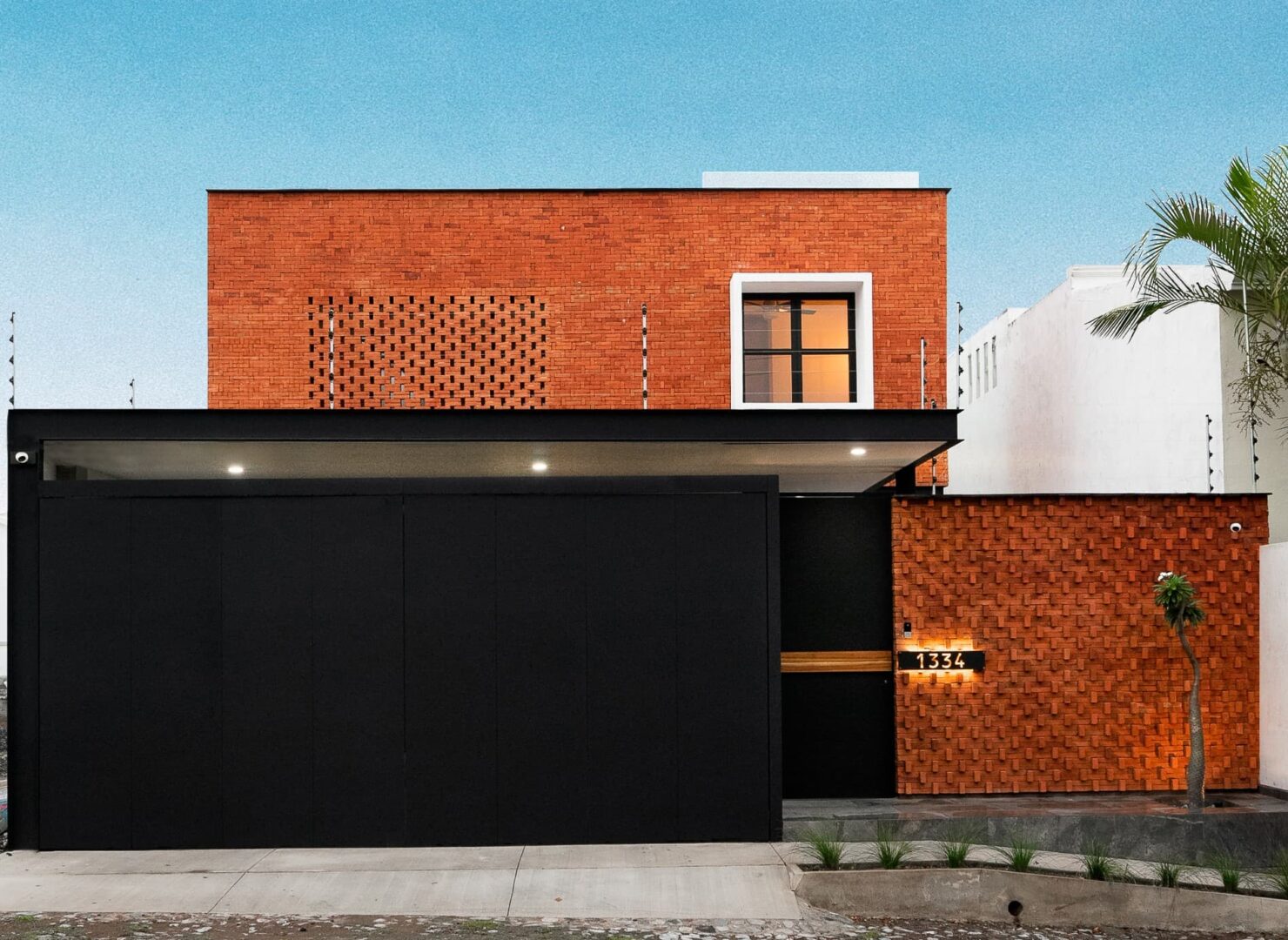
The constraint of plot size restricts us from introducing the loops to our elevation which brings us to using old era arch windows into our elevation. The arch window was originated by the Romans in the olden times which have been twisted with bold color of texture. This house is the combination of contemporary style along with very famous Indian element….circle (credits to our great Mr. Bhattacharya). Circle is considered as the most eye pleasing element as it removes all the sharpness in a wholesome. The circles are deliberately used according to the user of the bedroom as well as our style. From exterior to interior the style, akshanksh is the fusion of contemporary and indian style. The astounding façade was something that broke all the stereotype of straight windows and flat elevation. Though the plot size restricted us to, it couldn’t restrict us to develop a shape and break the elevation.

Why to think more and design less , because our design is something which not only reflects the beauty of it but also on the users mind. Minimal is good, Minimal is the future but when its eye catchy no one help but to at least have one glance on it which brings us to have bold choice of choosing scarlet beauty. Minor detail of giving offsets to arch and creating an alcove out of it enhances the window more and even helps to give amazing throw of natural light in the room with its shape. When we design it should have a hold all over the house and our main focus stays in making it look one.
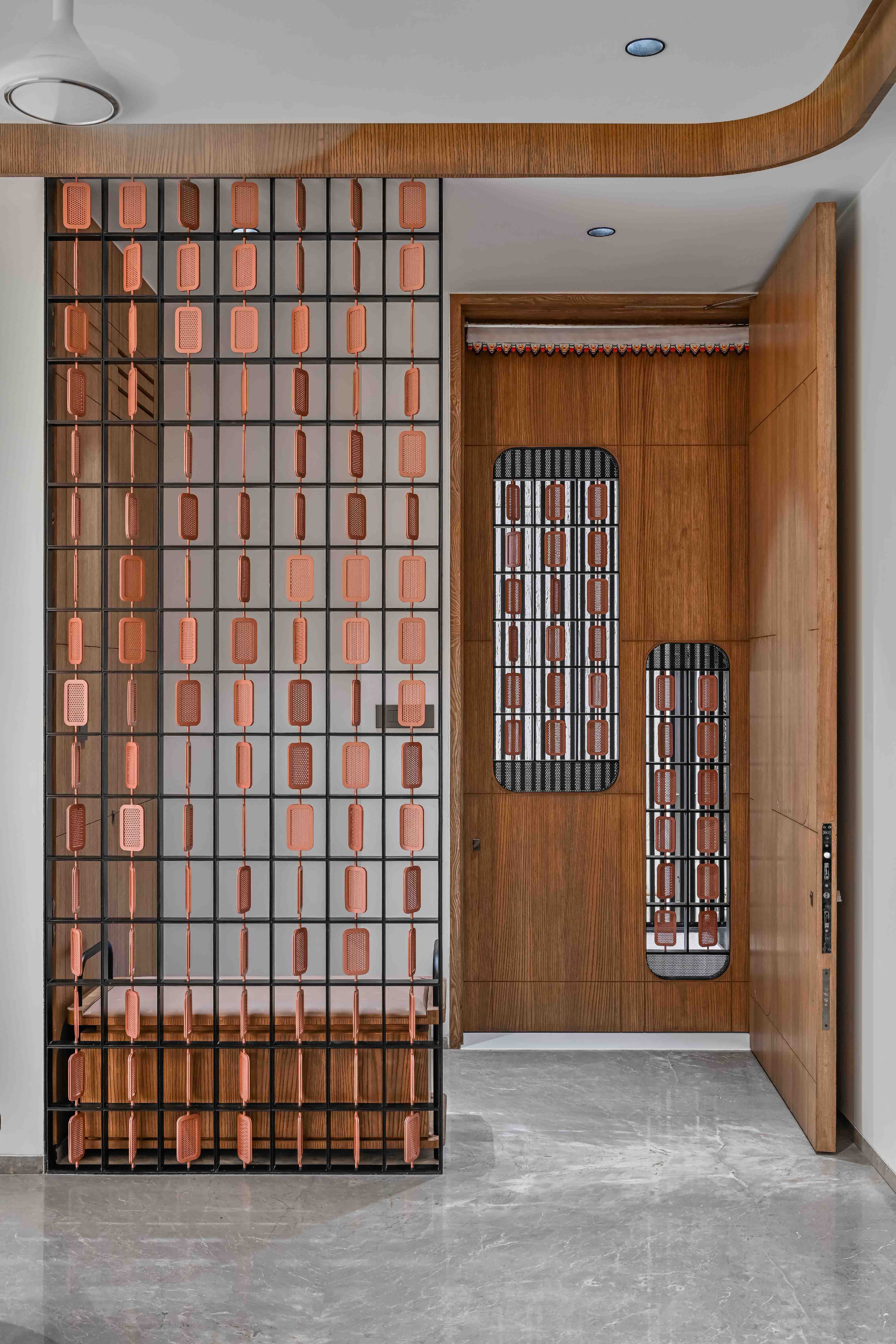
From the detail of outer staircase to the last detail of sky light every element dances with holding one string of fusion style. The Main door is an enlarged part of inside screening. The main purpose of screening is always to create a barrier maintaining privacy but along with its transparency. Here by, each module of the jail have a perforated metal sheet containing small circular cutouts and a thin line of metal plate binding the edge of it. If we have took the step of using scarlet for our elevation why to leave the metal jaali black? Thus it was finished with candlelight peach color of PVD coating. Moving further to the family room, the walls were kept untouched with just plain color look highlighting our TV unit as well as the sofa with its composition. The amazing tv unit undertakes a role of thick support for the cantilever staircase in the back.
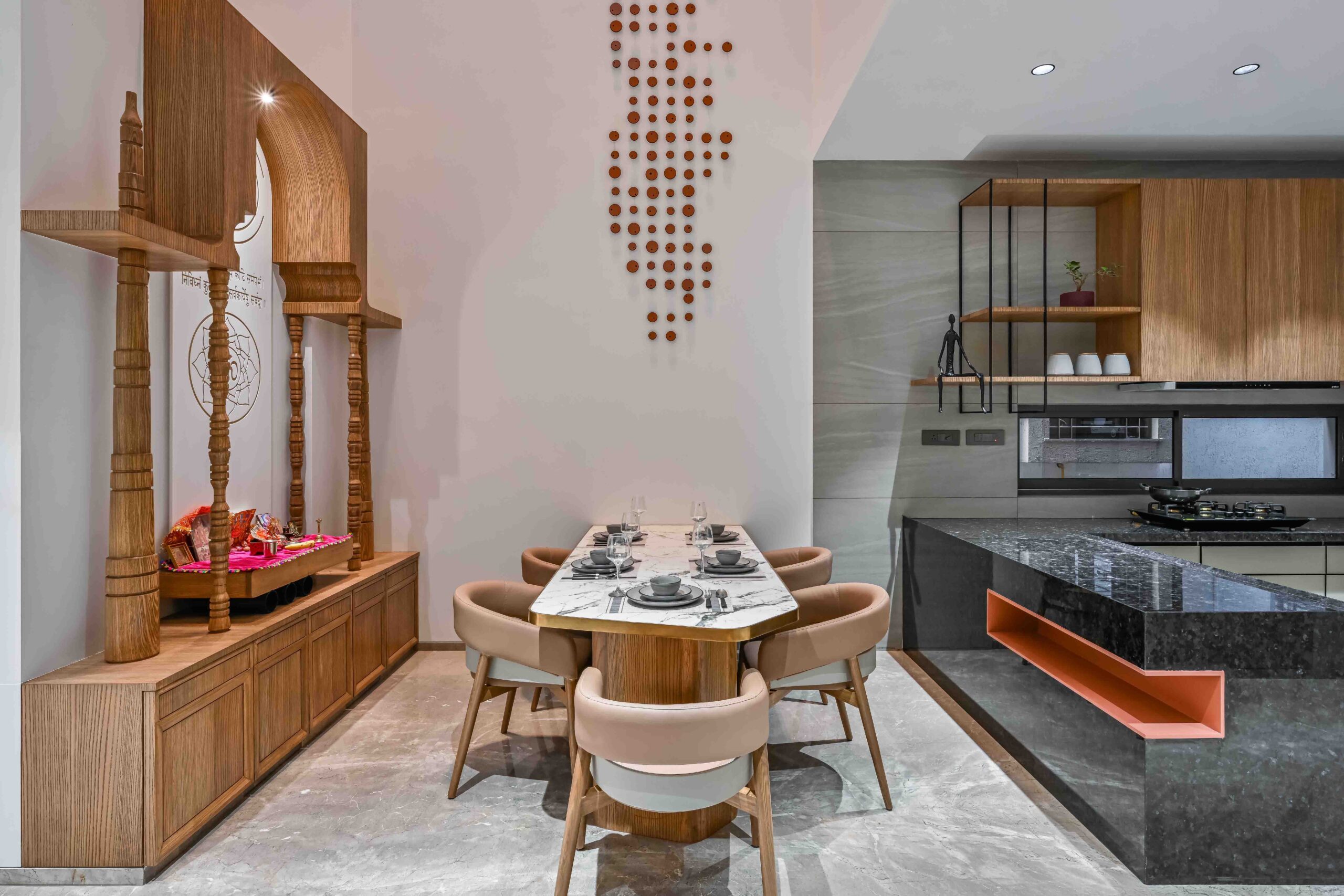
The most interesting part of the house comes now, the full height space where our dining table and pooja is situated. Even though, the plot size is compact we succeeded to give 4 bedroom along with double height space and open terrace. The benefits of double height made our client happier than ever. It helped our client to have smooth conversation with their family members all over the house and as we say more the communication better the relations. Apart from that it works as a great ventilation for the sunlight as well as air circulation directly from the kitchen.
What do you think about having breakfast under the morning light of the sun, amazing isn’t it? The first floor gets complete with the parent’s bedroom.
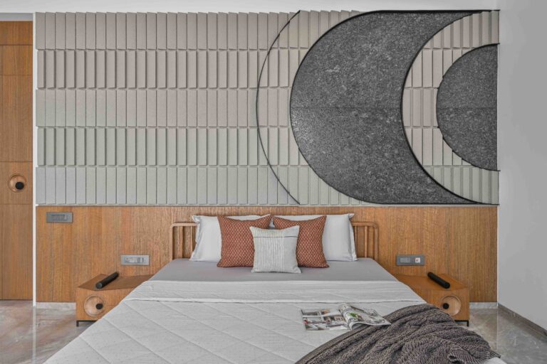
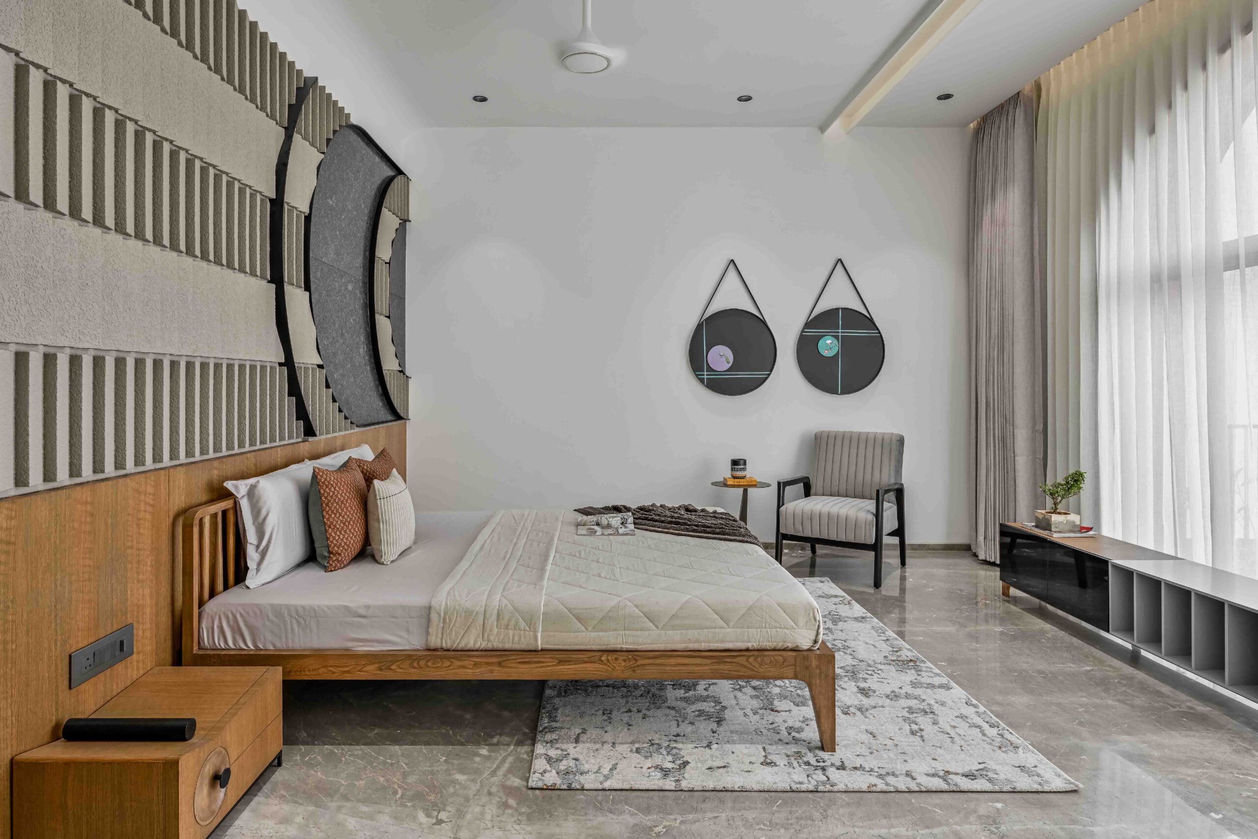
Climbing upstairs brings two bedroom the front master bedroom and the kids bedroom. The ideology with the master bedroom was to not let loose the hold of our exterior. Cladding of tiles and natural stone has been completely avoided in our akshanksh. Use of textures and simple colors was something which brighten up the whole room. The exact mirror of window wall has been covered with patchy texture along with boldness of black granite shaped in an offset of an arch but in a rotated form.
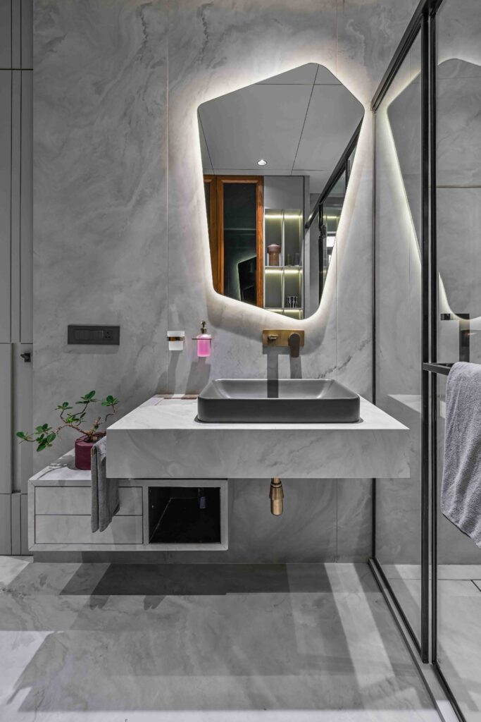
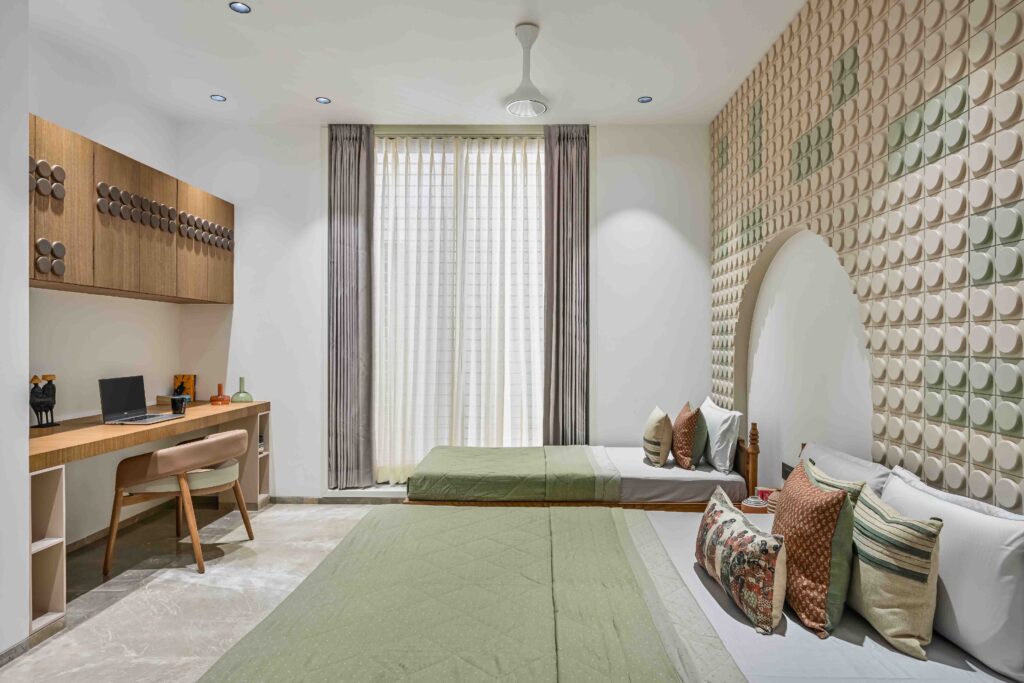
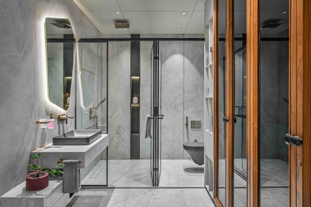
To keep our eye stable to the back, bed was just a compliment to our design. Our design simply speaks design and not luxury resulting the woody bed along with the side unit and all other upholstery. The Attach toilet has an amazing tone of grey stimulating peace while doing the first chore of their daily routine. The rest rooms were incomplete without adding any shapes to it thereby resulted the broken yet curvature shape of mirror enhancing all over the ambience. Moving forward to the kid’s bedroom…. Lego here it is
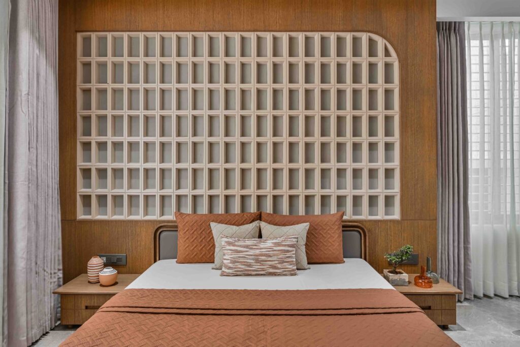
The most common game all the kids played in their childhoods and even the parents while taking care of their kids… We wanted to bring back all the memories back to our teenage clients but also with a bit of maturity as our client specifically didn’t want any complain in the coming future regarding the room being too kiddish. To break the Lego wall we have kept toning of two colors beige which never gets old and the most subtle color green mint. All over the purpose of study table were taken care too. Rest room for kids were designed under flaky terrazzo chips keeping it young yet subtle. The top floor is been completed with one bedroom and half open terrace. The last bedroom is design according to the modules. Till now the spaces were design in the similar manner and so were the last room. Each modules where synchronize by thin border creating a cube and filled with fluted beige color tinted matte glass. “ Akshanksh hold details, design as per the user and proportion as per the space.” – said by Ankit Sojitra
Planimetría del proyecto.
Te gustaría publicar tú obra, articulo de opinión o quieres dar a conocer un producto o servicio contactanos


